Designing and Product Managing
High-level summary
I designed a filter for a list of customers’ financial transactions using Zelle®. The design was for the customer care center and the users were the employees in the center. The design was intended to be easy to implement.
My Role
PM/Experience Designer
Challenge
The customer care centers serve millions of customers and high a high employee turn over. A manager of one of the customer care centers came to our team with a problem: when customers called the customer care center asking about a specific transaction, the transaction search results were taking too long to load, lengthening phone times and providing a bad customer experience for the customer and the employee.
Understanding the problem
The transaction searches retrieved every single transaction from the customer’s transaction history. Some customers have hundreds, even thousands of transactions. Finding an individual transaction was a long and arduous process for the customer-care representatives. They had to read every single one of a customer’s transactions in reverse chronological order. Meanwhile, the customer on the phone had to wait. I decided to solve the endless-loading problem by only loading the most recent 25 transactions and placing a “Load more” button underneath those 25 transactions in case the customer care representative wanted to search reverse chronologically.
I decided to solve the searching-in-reverse-chronological-order problem by designing a filter. The story of how I created that filter is below.
Ideation
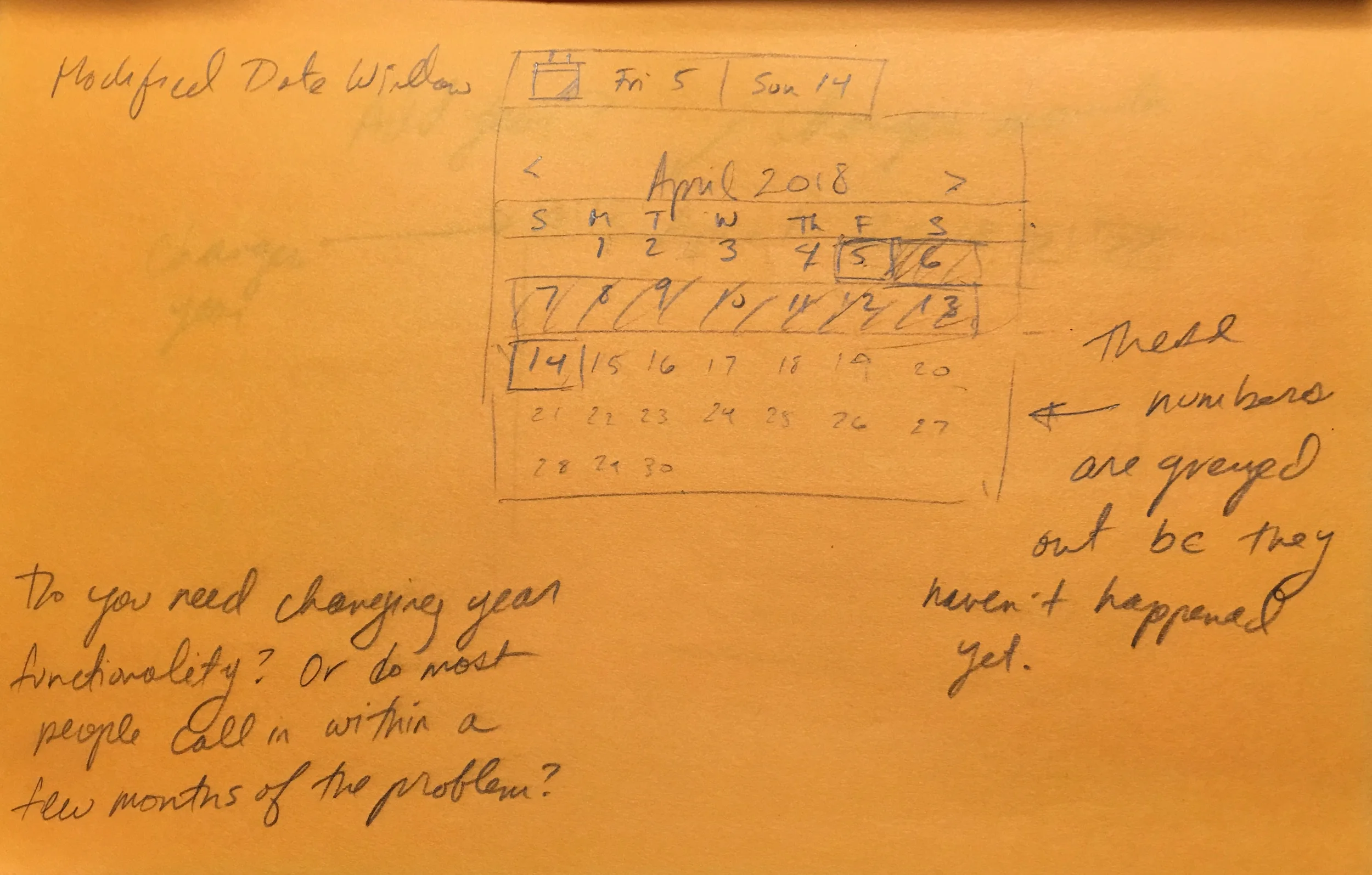
As I was creating low-fidelity designs, I began thinking through the requirements for the user story.
Requirements from Ideation:
Dates must be able to start at the beginning of a customer’s transaction history
Dates in the future are greyed out
The end date cannot be before the start date
Dates in range are highlighted
Designs
I added the filter transactions button to the left side of the page above the transaction cards. Because, that space had been empty and because filtering by date will be the most frequently used function in the “Transaction History” tab, so putting the button above the transaction cards, on the left gives it more salience than any other place on the screen.
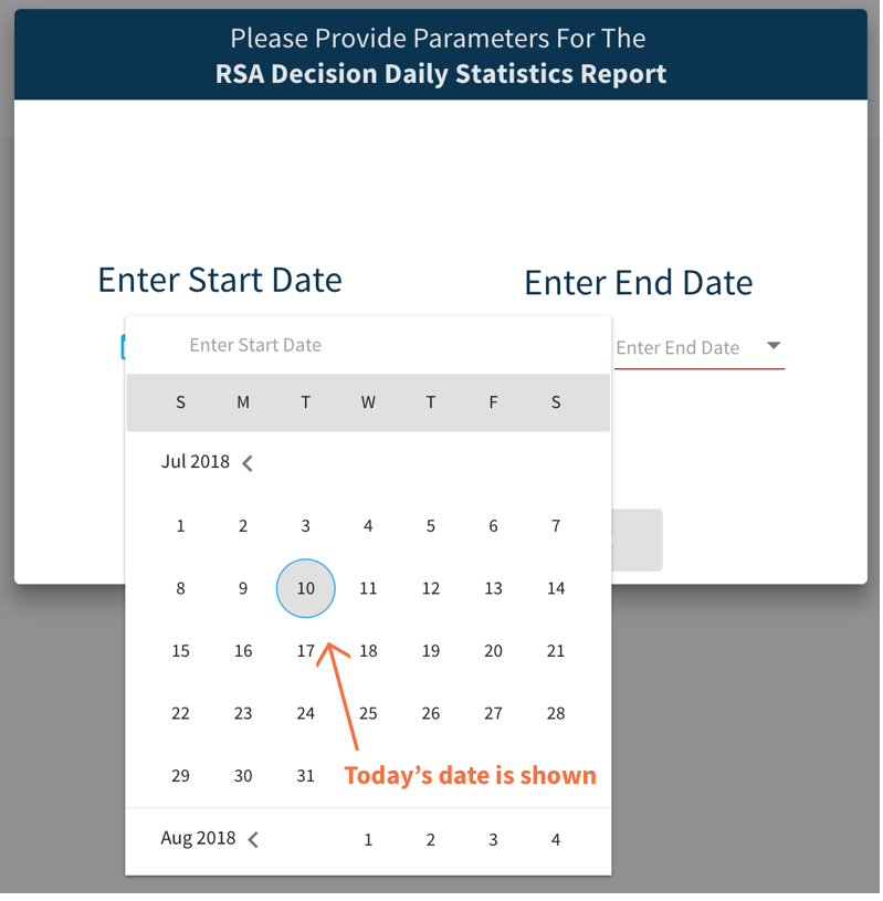
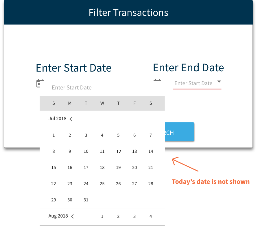
Original
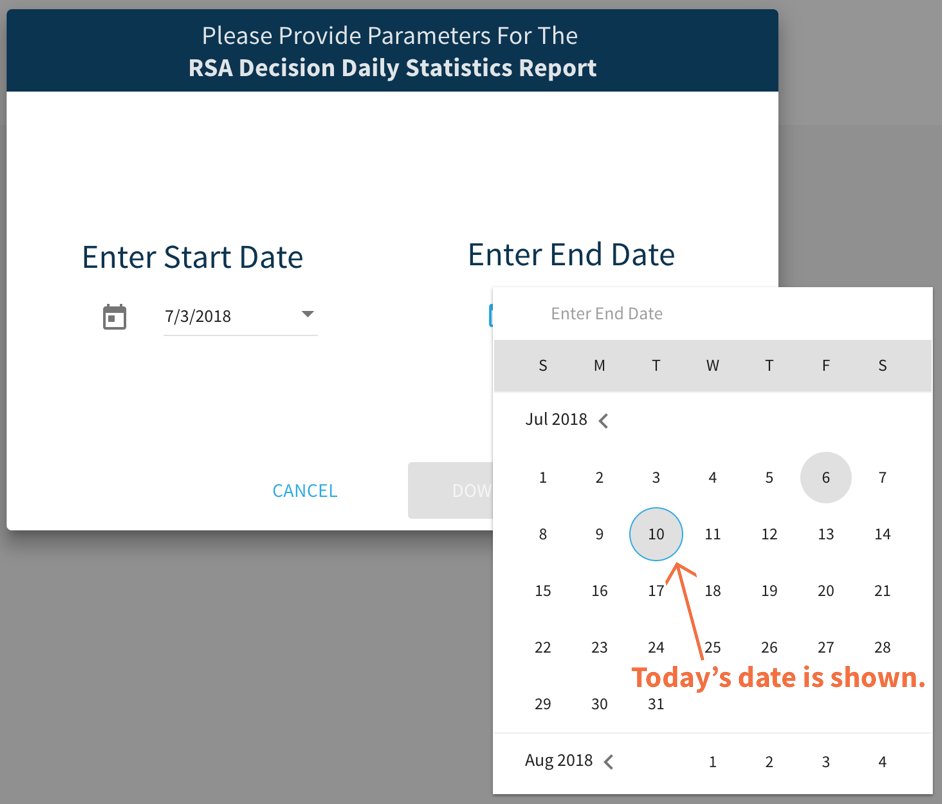
Redesign
I designed larger and more visible buttons “cancel” and “search” buttons making them easier to see.
Archives are about the past, so the suggested start date of a date range filter in an archive shouldn’t be today’s date. If I’d had more time to test the design, I would have tested to see if keeping the present date highlighted served as a landmark for finding previous days, but without the time and resources to do that I opted to eliminate possibility of confusing the customer care center employees.
Further, the first date in the selected date range should be immediately visually clear.
The original design showed today’s date and the end date of the date range. My redesign shows the start date, the end date, and highlights the span of dates in-between so that the selected date range is immediately visually clear.
I added a visual representation of the date filter to the transaction history tab. After selecting the date range, users can see the date range they’ve selected adjacent to the filter transactions button. Further, this filter design can be used for other filters in the future, for the other categories on the transaction cards: Speed, Status, Transaction ID, etc.
Meeting BAs, POs & Devs
Meeting with the BAs and POs gave me insight into the requirements and the design. For example, the calendar search is only one filter of many that they hope to add to the system. So, instead of creating a calendar filter directly on the transaction history tab, I created a “FILTER TRANSACTIONS” button. That way more filters can be added to the design in the future.


